
I hadn’t planned to make a list like this until LitHub and Casual Optimist dropped theirs, and if this list looks mostly like I cherry-picked my favourites from their lists, well… that’s exactly what I did.
I feel a little guilty copying their homework, but Best Book Cover lists tend to feature a lot of overlap anyway. LitHub’s in particular is composed mostly of designers working in-house with studios and publishers, recommending the work of other designers working in-house with studios and publishers, all of whom have marketing budgets designed to boost certain books, and getting on the LitHub list is part of that marketing, so even if these covers are very good, there’s a feeling of manufactured consensus. Which is… well, it is what it is. I like to think if I’d spent the year curating a selection of my own, the ratio of curveballs to group consensus would tend towards the curveball. But I didn’t, so here we are.
Anyway, Best book covers of 2025, lets go.
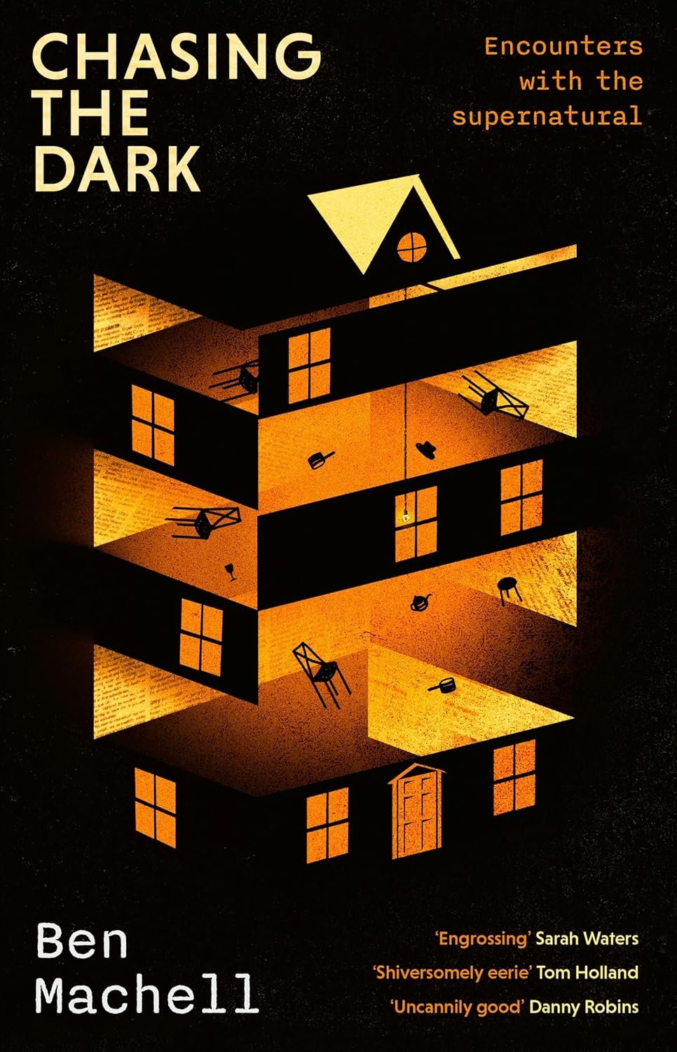
Ben Machell
Chasing The Dark
I can almost hear those pots and pans being poltergeisted around the house, which itself is shapeless and almost not there, more a ghost of a maze composed of lovely grainy textures going at wrong angles to each other. I feel there’s probably more than a little inspiration taken from the poster for Hereditary, with its puzzlebox house, but this also feels very much its own thing.
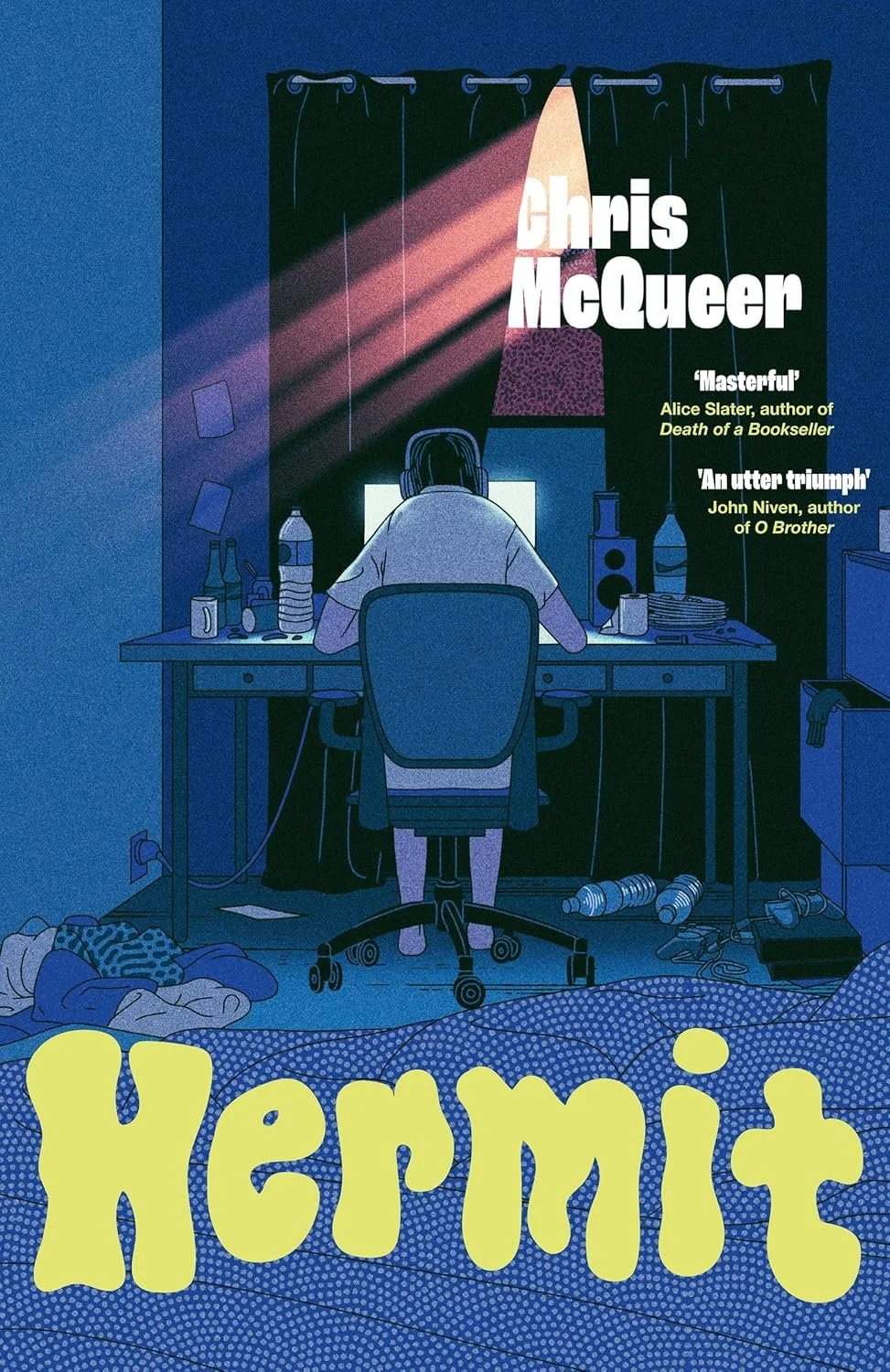
Chris McQueer
Hermit
I don’t often go for wholly-illustrative covers. I’m jealous, pure and simple, of people who can work that sort of magic. Yet not only does the illustration here hit all the marks - loneliness, chaos, self-loathing, a hint of redemption with church-like crepuscular rays of the outside world creeping through the curtains, that terribly sad little loo roll on the desk – not only all of that, can we talk about the title treatment? The audacity? Of setting the title? For a book about incels? In a blobby pale goo? That can only really bring to mind? Cum?! Quite literally gooped and gagged.
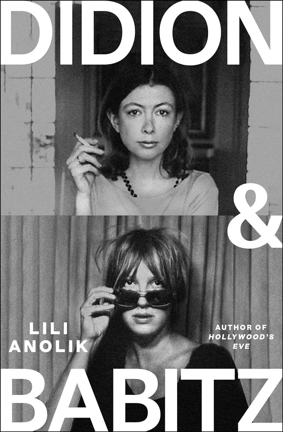
Lili Anolik
Didon & Babitz
On a crowded display table, this will be the first book you see, I guarantee. It feels loud and too close, like an argument crashing through from another room. And what of that argument? It sets up the rivalry between Didon and Babitz by giving each woman equal space, refusing either the focus. Didon, cool and collected, neatly framed and on top, only has to contend with her name hovering above her like a halo. Meanwhile a frazzled Babitz, glaring up at her competition, feels hemmed in and hassled by her name, the author’s name, the author’s credentials, the irregular pleats of a curtain sitting too close to her back. Without reading a single word, you get a sense of how each is positioned in this rivalry, how each regards the other. That’s storytelling, baby!
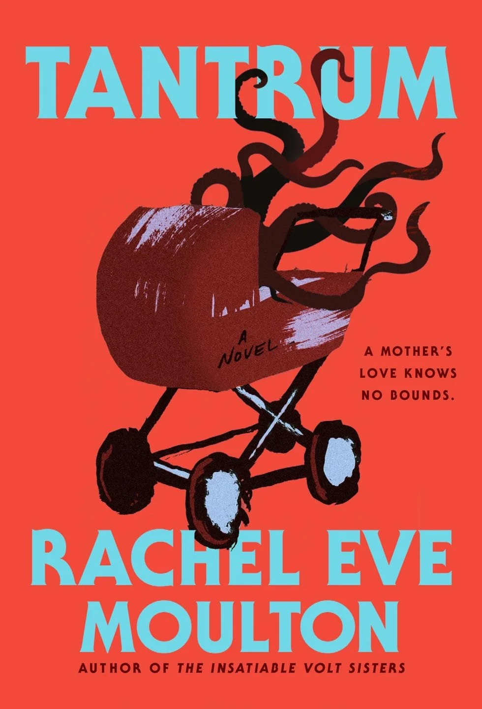
Rachel Eve Moulton
Tantrum
Sometimes when you know you’ve a strong image, such as tentacles bursting out of a vintage pram, you don’t really need to complicate things further. That said, the colour choices are what makes this, for me – the slightly-too-corpse-grey-to-be-baby-blue type, clashing with the mismatched violet highlights on the pram and wheels, which clash with the maroon bassinet, which clashes with the tomato red background. Everything’s a shade or two wrong. It’s great.
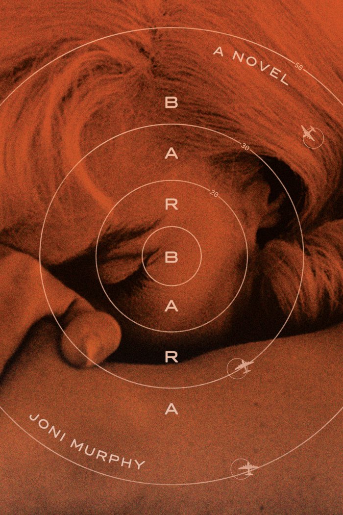
Joni Murphy
Barbara
The close crop on Barbara is unsettlingly unclear - is she resting, is she in distress, is she dreaming? It’s difficult to situate the story in a specific era, her Marilyn Monroe glamour not quite compatible, temporally speaking, with WW2 fighter jets. And all contained within an atom bomb’s blast radius, emanating out from her mind, suggesting shockwaves peeling back layers of identity, under a dense orange filter that’s just a little too saturated to be reassuringly nostalgic. There’s a lot going on here, vague but – much like the book itself, if reviews are to be believed – all tightly balanced like a fine hallucination.
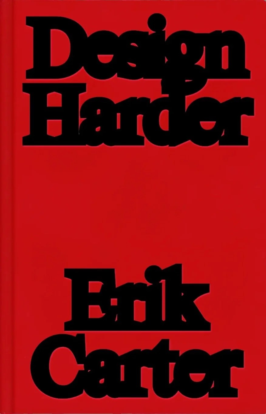
Erik Carter
Design Harder
Oh, I hate this. Which of course means I love it. I’m not usually a fan of type-only covers, but taking “design harder” as a mission statement and thickening the stroke on the letters way past what “good” design would allow? It’s too clever.
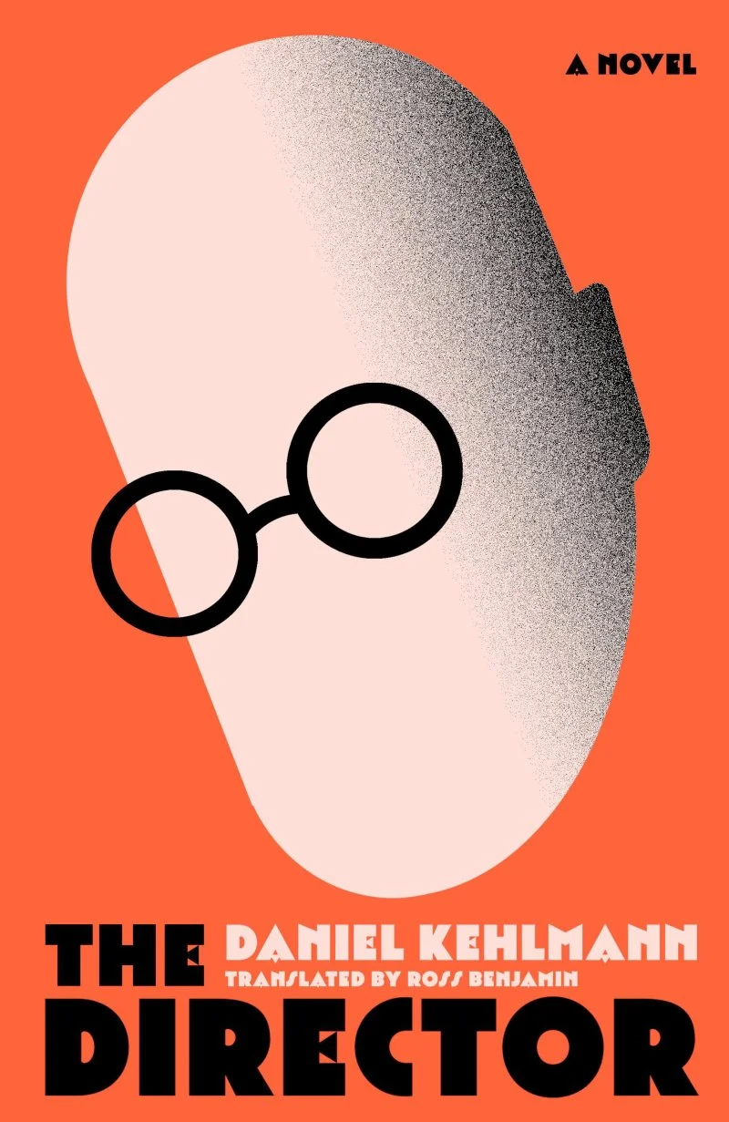
Daniel Kehlmann
The Director
Inspired by the life of film director G.W. Pabst, who fled to Hollywood to escape the Nazis but later returned to create propaganda films for the German Reich, The Director’s cover doesn’t fuck about. The slightly off-brand Nazi colour scheme, the Art Deco typeface, the big egg-head and little spectacles illuminated from below, suggesting a dictator gazing down from on high, or a director watching back a reel, or perhaps even (and this is where my mind went first, which I’m sure was not the intended reference, but it’s not a million miles off, either) an occultist gazing into the Ark of the Covenant, moments before his flesh melts…
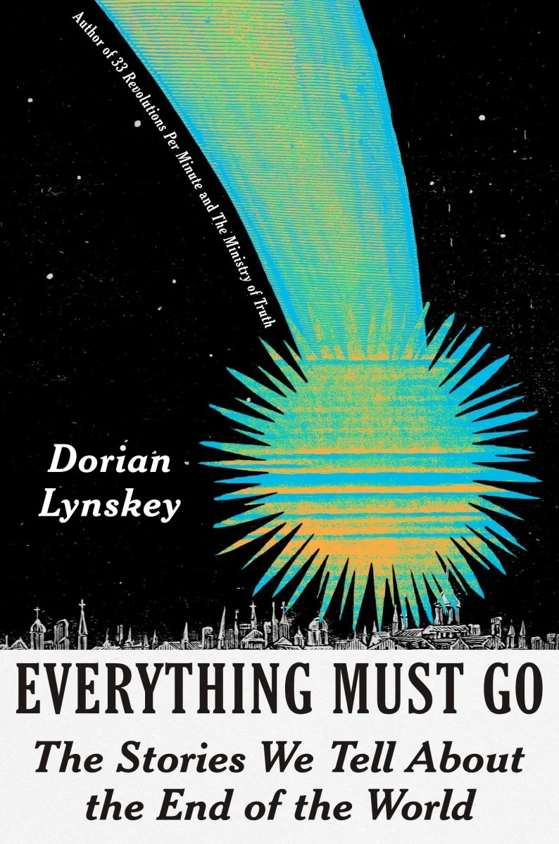
Dorian Lynskey
Everything Must Go
The outlandish sense of scale here is very fun – big big boom, itty bitty people. As is the ambiguity of what’s making impact. The fat tail says asteroid, the scratchy heatwave/corrupted VHS texture says atom bomb. The rustic woodcut town besieged by a colour out of space. Do I love the type treatment? Hmmm… I think it’s referencing vintage text-heavy newspaper headlines? I think there were probably many discussions about whether it should go at the bottom or the top of the page. I think, as I always do, that it doesn’t need to be so big. But! The title’s darkly funny and the image sells the concept, can’t really fault it for doing what it needs to do.
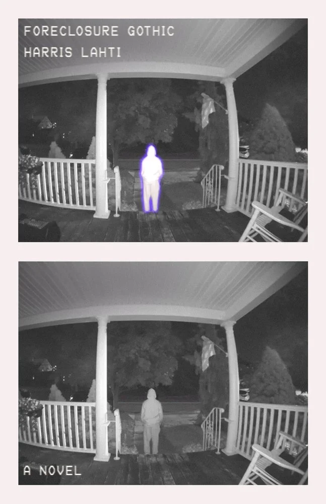
Harris Lahti
Foreclosure Gothic
It is nigh impossible to capture in print the eerie aesthetics of found-footage film, the experience of which relies on time passing, the image changing, the camera lingering too long on something empty, or something moving off-screen, or the viewer noticing something which someone within the frame has yet to notice, and maybe they will, maybe they won’t, but it’s the time it takes for them to see what you’ve seen, that creates the unease. Print doesn’t have the luxury of time passing - once you commit the ink to the paper, the subject becomes frozen in a moment. So, how to capture that Ring Camera panopticon uneasiness on a book cover? Two frames, identical but for a strange glow around the subject, standing just far enough away to not be a threat yet, but a little too close to not be a threat at all. Also, it would feel more natural to read the bottom image first: an escalation, a growing illumination. Instead, with the glowing figure read first, this feels like we’re seeing something uncanny cooling off. We’ve joined the story just a little too late, something’s just happened that we weren’t privy to. This cover gives us time and distance, but not enough of either to feel safe.
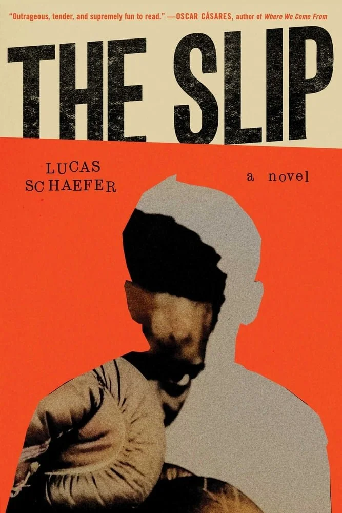
Lucas Schaefer
The Slip
A magic trick of misdirection – every single time I look at this cover – every single time – the flat orange and sharp line of the cut-out directs my gaze straight to where the cut-out’s face should be. It’s not there, of course, and only then do I feel my gaze pulled away to catch the eye of the boxer, blurred, grainy, muted, obscured, unseen, unexpected, and coming in with a mean right hook. Everything else is jostled, as if we’ve just taken a punch, and here comes another. I’ll come back to this tomorrow and it’ll happen exactly the same, like hearing a joke for the first time.
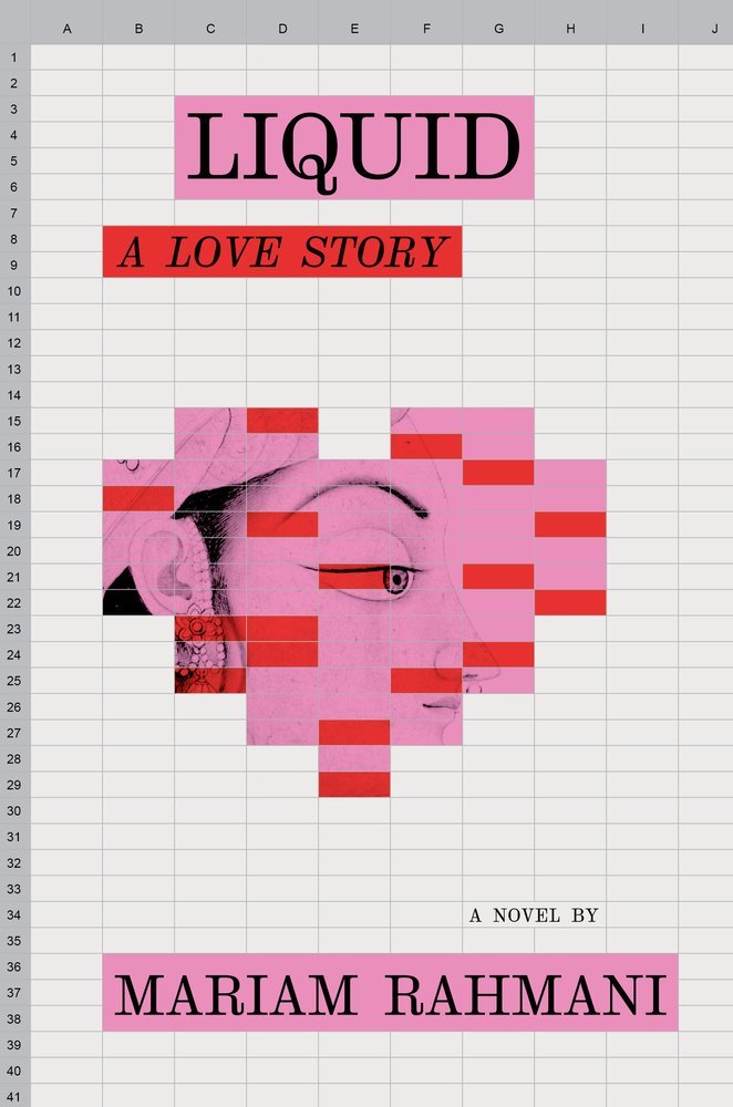
Mariam Rahmani
Liquid: A Love Story
In which an Iranian-Indian American woman goes on a hundred dates, tracked on a spreadsheet, in an attempt to marry rich. The writer in me appreciates the duality of the title, either referring to liquid assets, or something more sensual. Indeed, the UK cover makes the subtext text, with a watery type treatment and a close-up of sweat on skin, but I’m much more charmed by the US version, clunky as Excel, deliberately naive, dryly goofy. Like, yeah, sex is good, but when the shaggings done, you do want someone who can make you laugh.
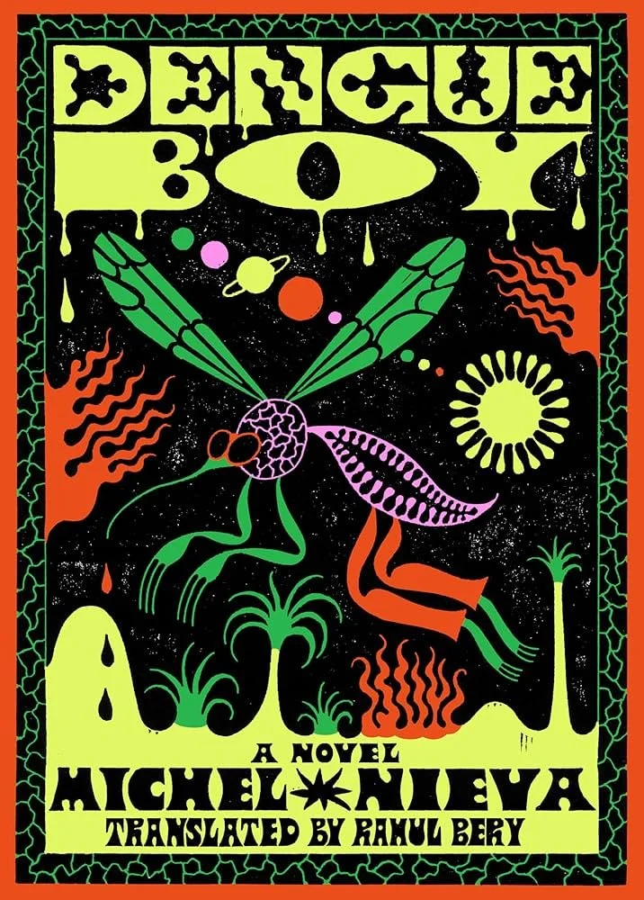
Michel Nieva
Dengue Boy
If I’d written a book that presented even the slimmest glimmer of the cover featuring a be-sunnied mosquito man crossing a swamp under a planetary alignment with 2020s-psychedelia revivalist type rendered in a block-printing style, well, I’d want nothing less. Beautiful balance of colours, too, with the medicinal purple popping against an otherwise evenly matched sand yellow, blood orange and nursery crayon green.
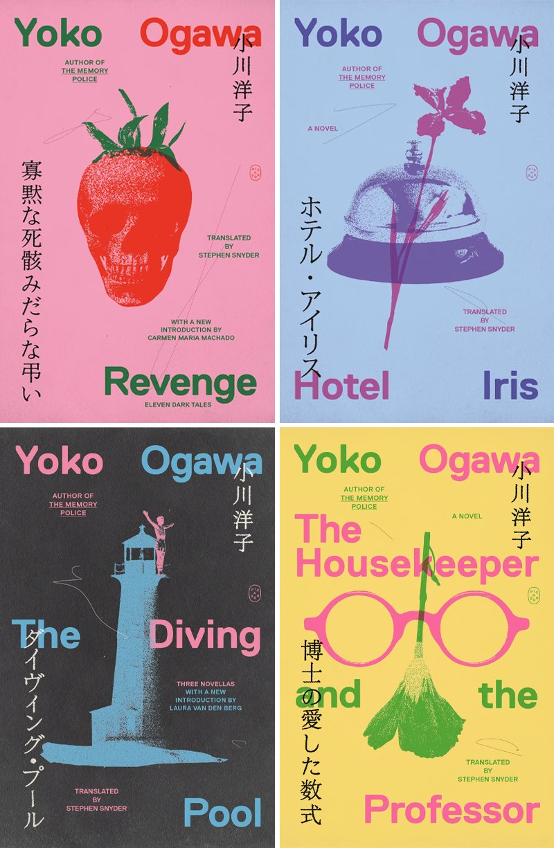
Yoko Ogawa
Revenge is the obvious stand-out with its skull-berry, but the series as a whole enjoys a brilliant balance of flexibility and rigidity, given how much content jostles for space on each cover. The placement of the author name, in Japanese and English, stays put across each title – along the top then down the right. That’s an important anchor. The Japanese title has a set location – it has to end at bottom left, but can stretch up to any height. This is mimicked by the English title, which ends bottom right but can also stretch to any height. The translation credit and the subtitle, however, go a-wandering, so as to keep out of the way of the image, always centred, always a superimposition, echoing the overlap of the two languages. Taken individually, they could read as messy, disjointed; taken together, a system emerges, not so strict that it can’t be playful.
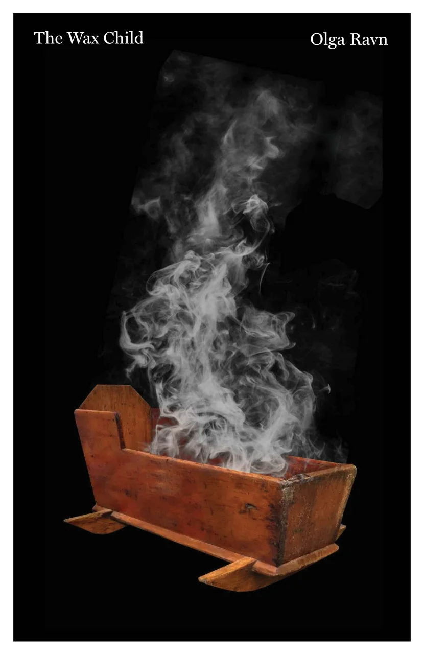
Olga Ravn
The Wax Child
See? See what happens when you don’t splash a title across the middle of the design in supplication to the Thumbnail Gods? You get to gift the entire cover – the entire cover! – to a haunting image of an unseen wax baby going up in smoke inside a creepy-ass bassinet* that looks more like a coffin. Go on, picture this with giant yellow text obscuring most of the smoke and the rocker. Rubbish, isn’t it? The image is strong, but the design choice to get the hell out of the way is what makes this sing.
*I was not expecting to use this word twice in one post.
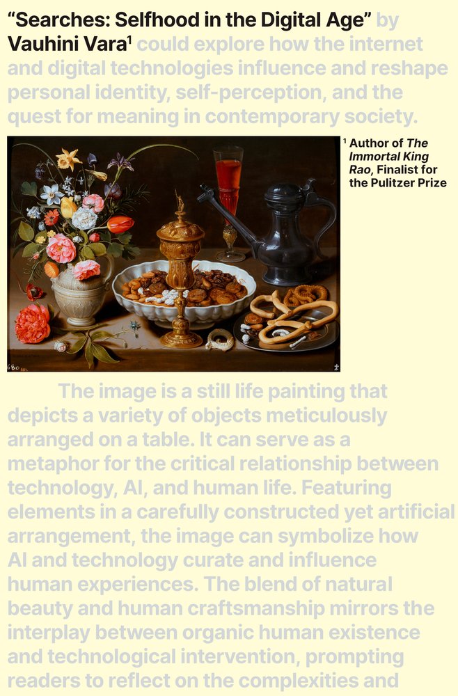
Vauhini Vara
Searches: Selfhood in the Digital Age
Look, you do not, under any circumstances, have to hand it to Generative AI. The tech is perhaps humanity’s most unambiguously disastrous blunder since the atomic bomb. No good whatsoever can come of it. Except for this cover: an AI mimic of a still life, the focal point of a layout that riffs on John Berger’s Ways of Seeing, which famously delivered to the masses an accessible entry point to academic considerations of media literacy. It’s very clever, something GenAI is not.
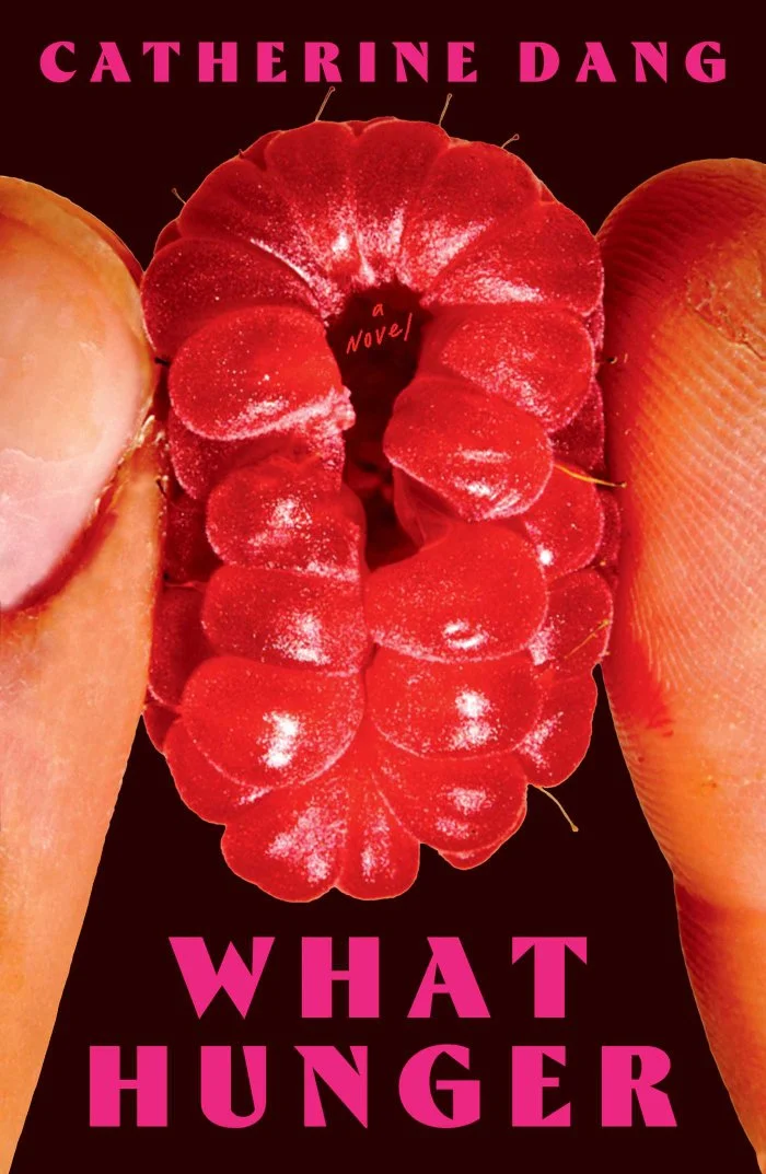
Catherine Dang
What Hunger
The close-up-of-fruit-as-symbolism-for-sex era is dead, long live the close-up-of-fruit-as-symbolism-for-sex era. That teeny tiny ‘a novel’ in the berry’s navel couldn’t get any smaller, so much so that I wonder if the designer didn’t want to add it at all, but it does add a little something to the extreme zoom. Also, girl? Moisturise.
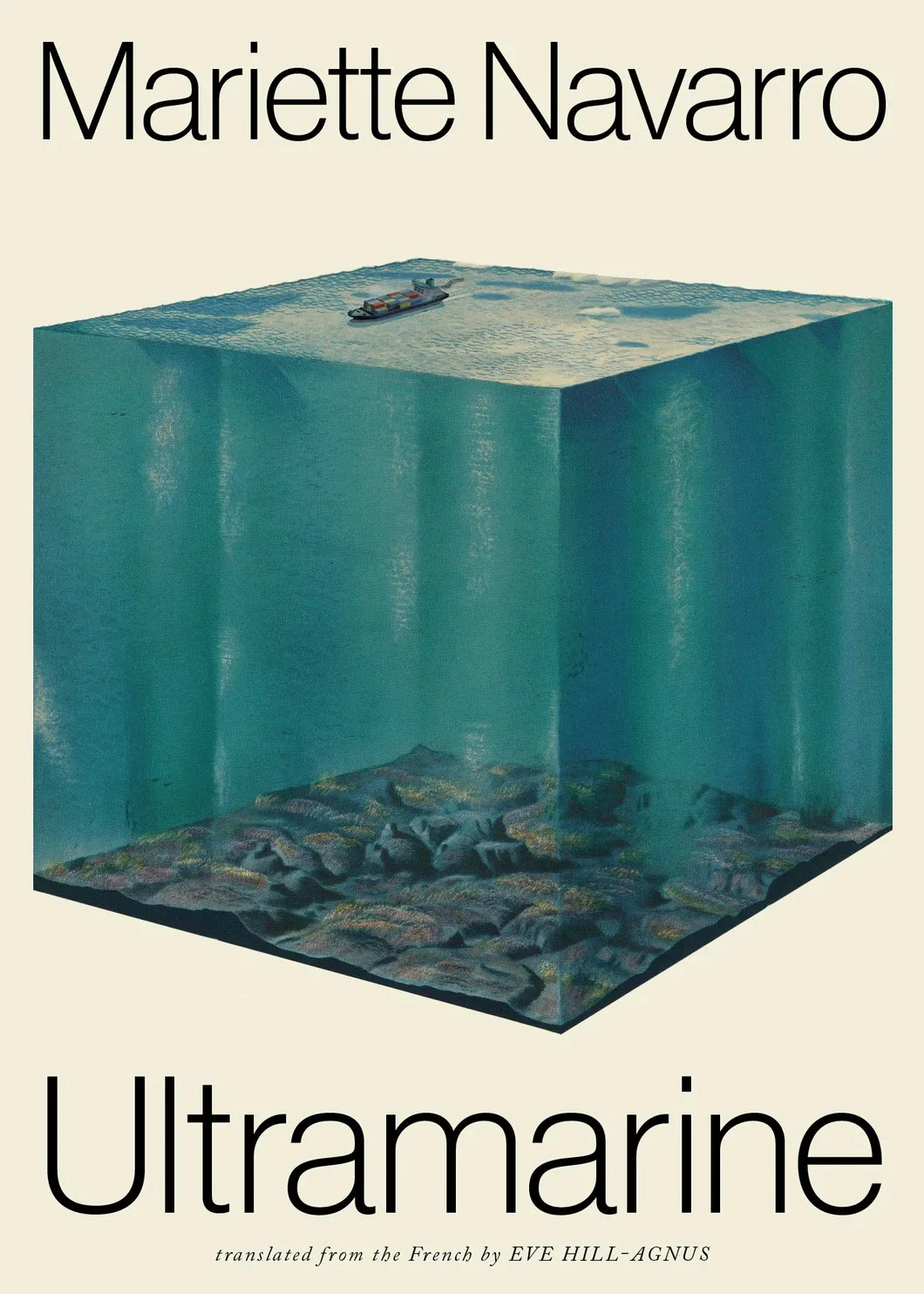
Mariette Navarro
Ultramarine
Who doesn’t love a big ol’ gelatinous cube of ocean? I mean, the Thumbnail Gods have struck again, but at least the typeface feels as artificially restrained as the cube of ocean. A lot of what I love here, I also love in the illustrative work of Owen D Pomery – the almost inconceivable difference between human scale and planetary scale, the imagined boundaries to something as boundless as the sea, the artificial clarity of an ocean floor seen in cutaway.
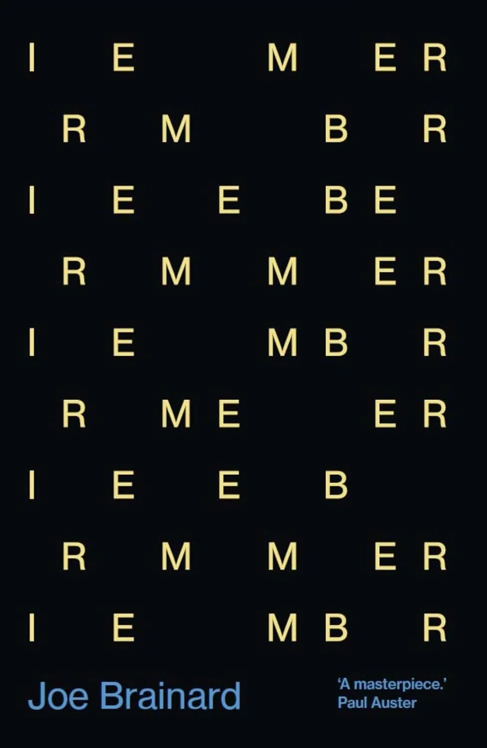
Joe Brainard
I Remember
High concept. Simple execution. No frills. In the words of Saint George Michael, if you’re gonna do, it do it right.
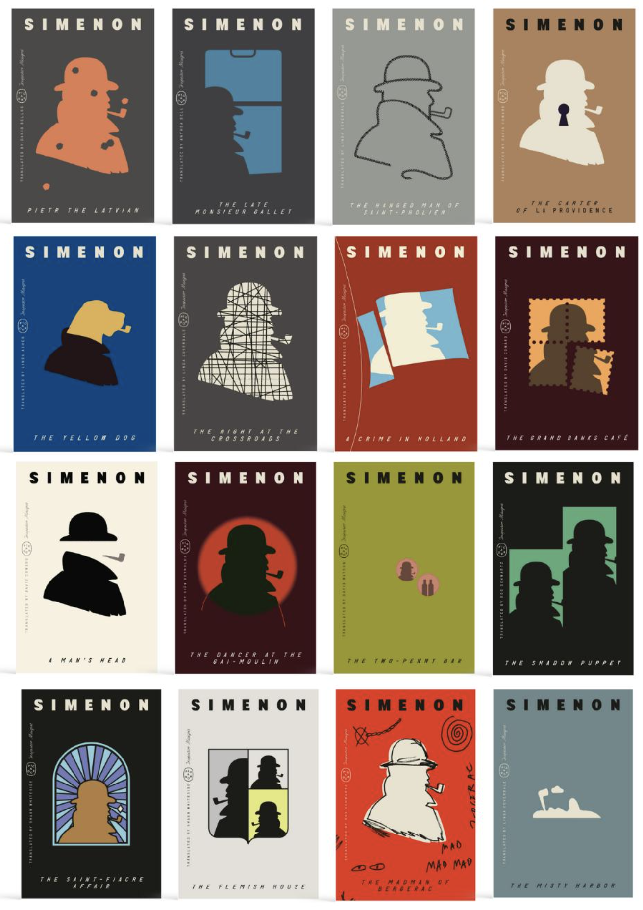
Simenon
Another series – and I love when you can tell the designer’ just having a lot of fun riffing one central image off as many themes a possible. My favourite, though, is bottom right, The Misty Harbour, silhouette of detective and pipe flipped 90 degrees to both be a sinking head and a steamy docks. I wish I could’ve been looking over their shoulder when they figured that one out, the unadulterated glee they must have felt!
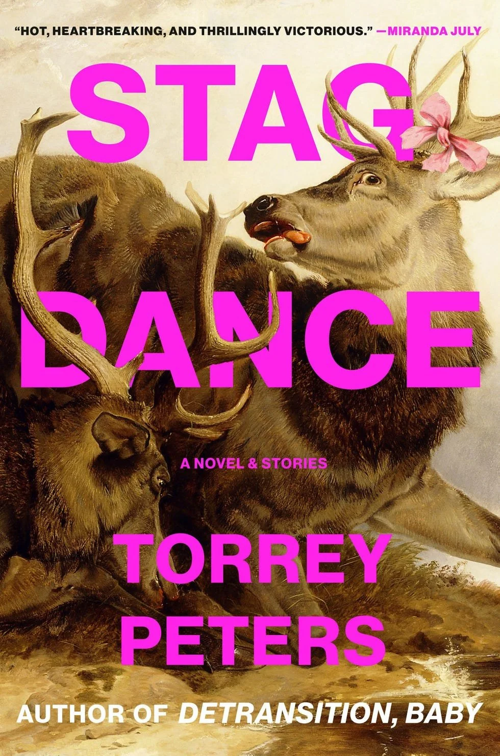
Torrey Peters
Stag Dance
I’m just about done with bright sans serifs being paired with awkward crops of paintings of animals in distress. But the bow. That fucking bow around the stag’s horn. One little pink flourish, and the stag’s horrified lolling grimace becomes something more like a silly selfie, one for the Gram. It says: sure, living is pain, but we’re damn fucking well gonna look cute while we struggle. If that ain’t camp, I don’t know what is.